AudiUSA
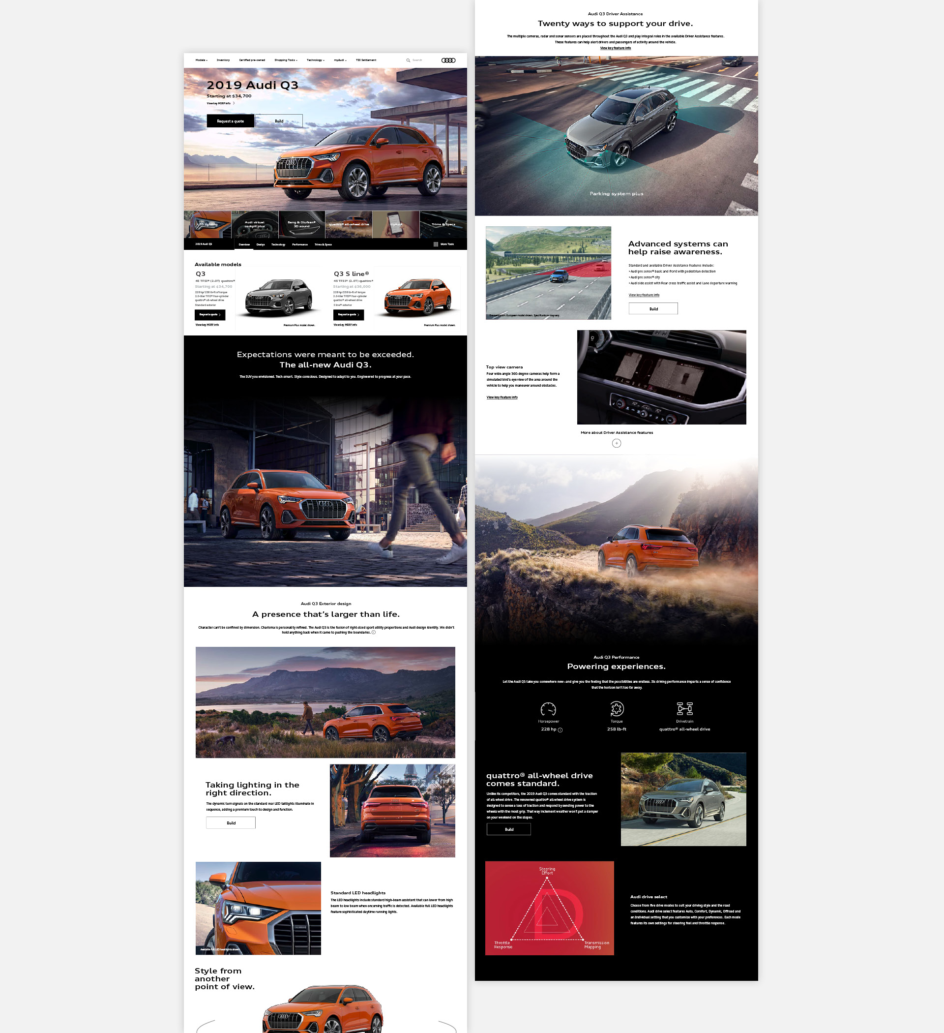
In this project, I helped reorganized the model landing page so that it worked in long form.
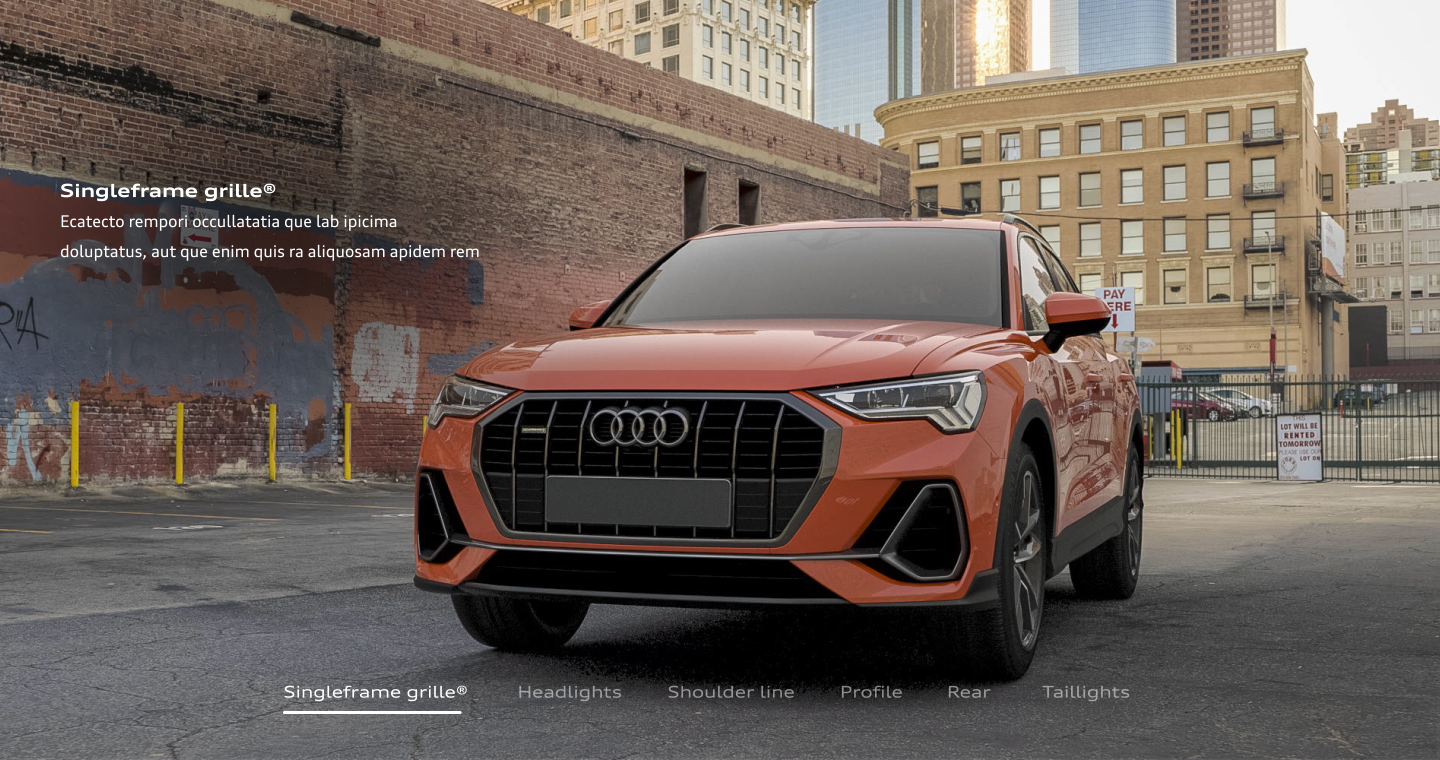
I found new uses for old components. Something as simple as a hover state, now acts as a laser pointer that points viewers to details of the car that the designer wanted them to see.
I also employed conceptual banners that communicated features of the product and captured viewer attention.
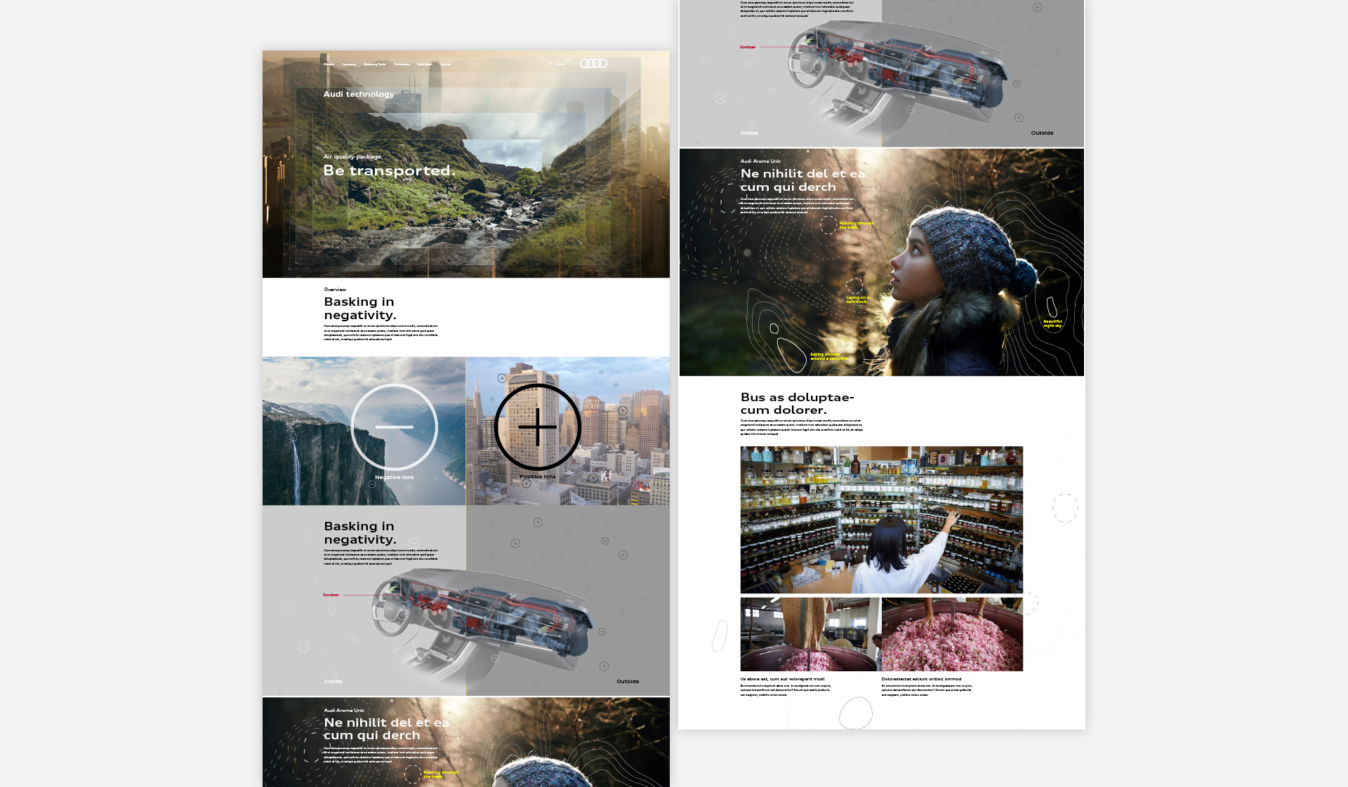
I analyzed the benefits of the Air quality package according to the manufacturer and conveyed it in a visually appealing way. When the user lands on the page, they immediately feel the benefit of mountain breezes, purified city skies, and memories of a childhood in the outdoors. My design shows that after several layers of filtration, dirty city air can be as clean as the air that you find in nature through ionization.
The hero serves as an attention-grabber. After getting the user’s attention, I wanted to pay it off with images that explain clearly how the unit works.
As the user gets deeper into the page, I wanted to hit them with the feels and how scent and smell is important to their memories, before going into the scents available in the Aroma Unit.
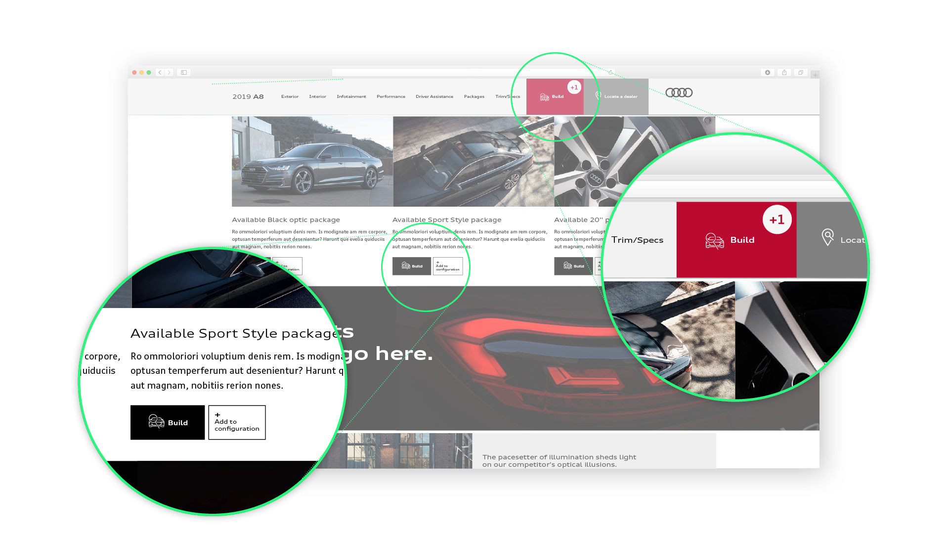
Throughout the website, we sell packages and new features to the consumer. Since the consumers do engage more with certain call to actions to personalize a vehicle, I made it easier for the user to add a feature to the car they were building in the configurator right after learning about it.
The sub-nav would help keep track of what was added.
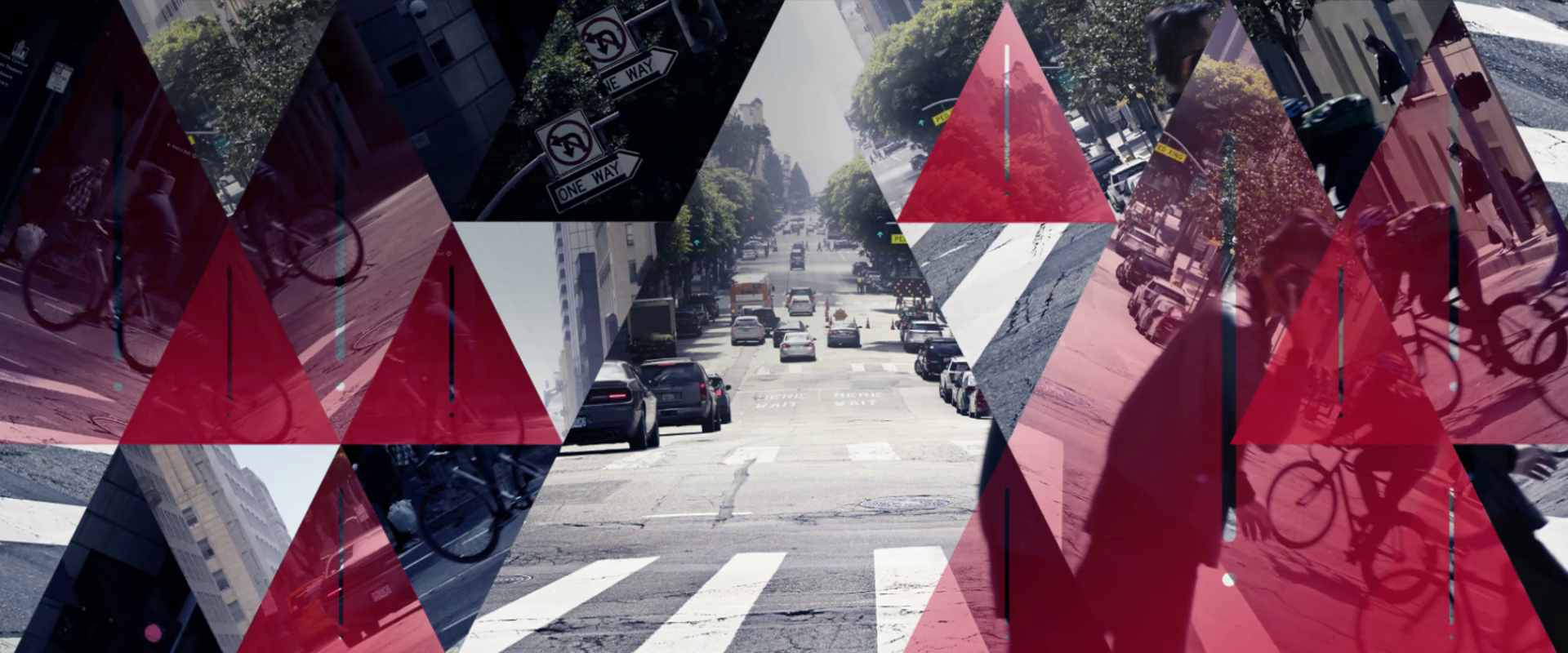
Borrowed from Audi library, Conceptual Intros help break up the page and let users know that they’re entering a new section. This one is for Driver’s Assistance. I took the icon that appears on the Virtual cockpit and made it into a design element. The triangle in the middle represents the path that you want to go. Everything outside the triangle in the middle is a hazard.

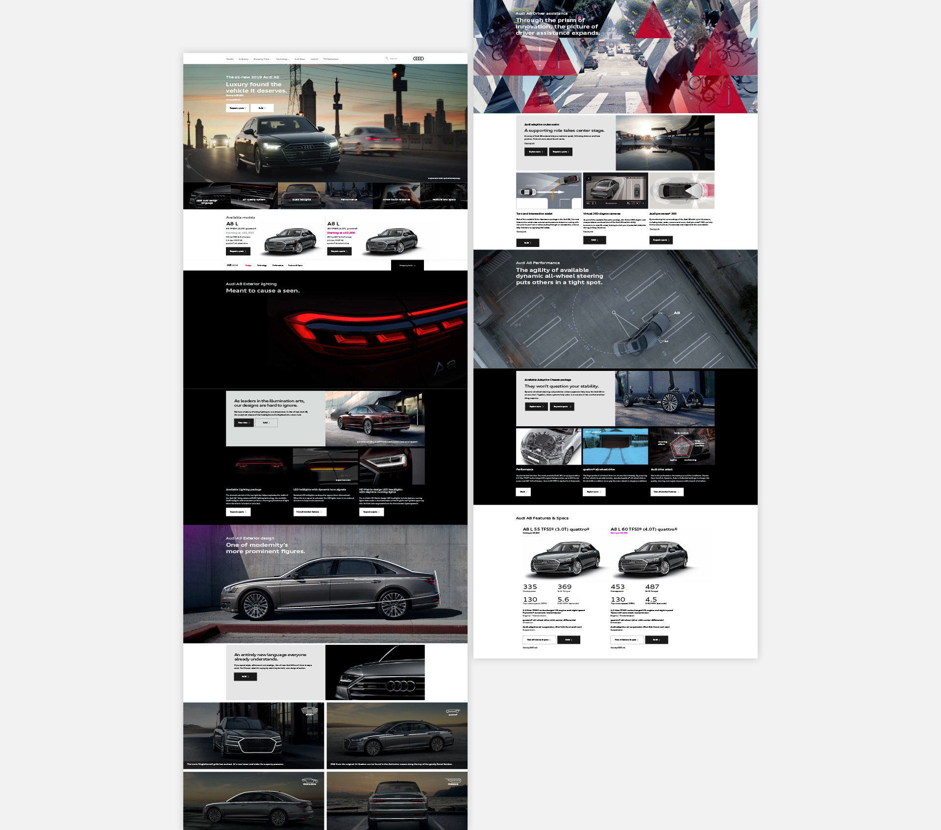
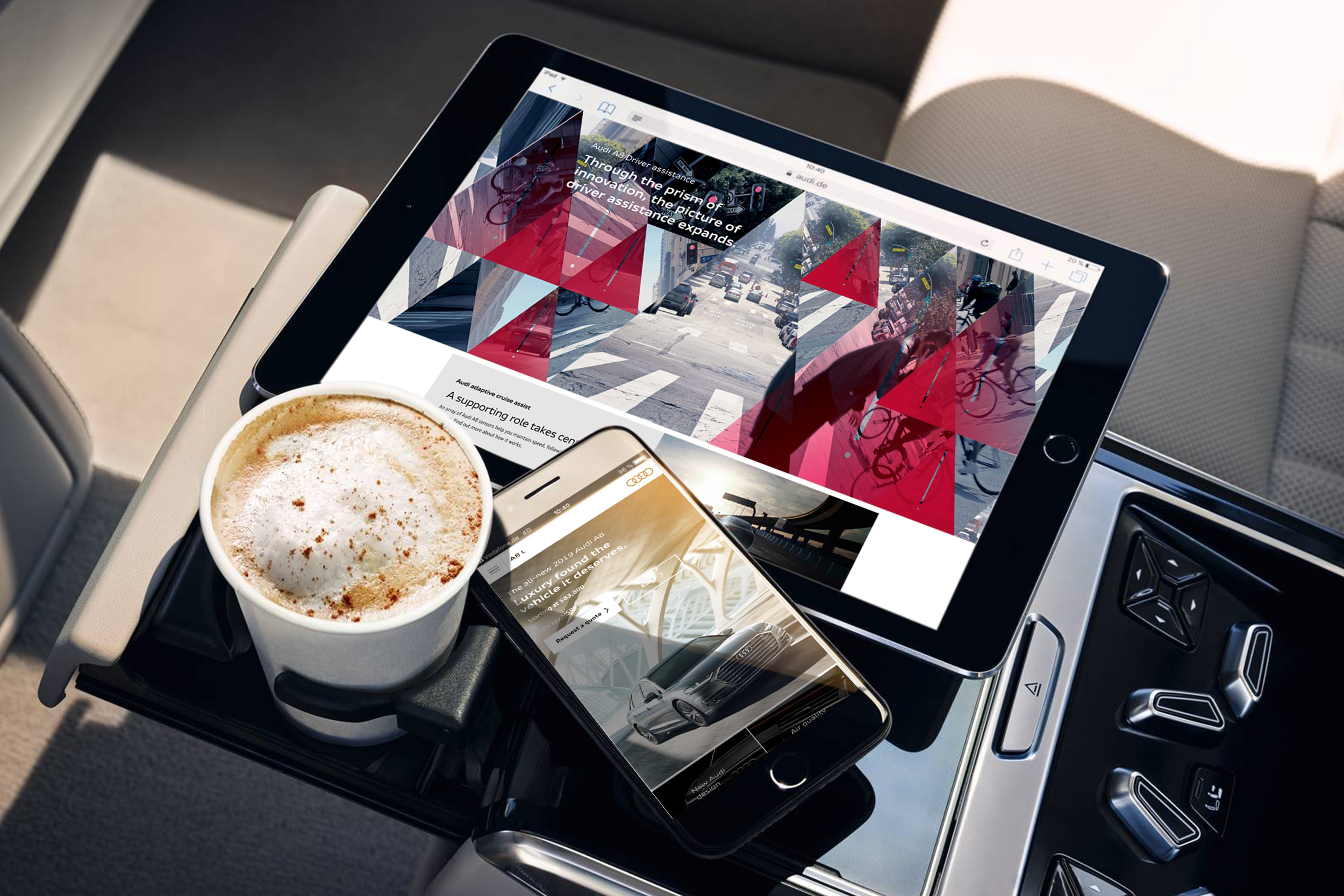
Audi A8 MLP is an example of creatively using components in new ways.
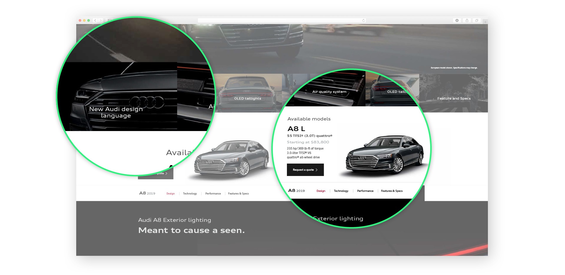
Just under the Hero, A8 MLP features a highlight bar. After learning first-hand what the constraints were of AoA’s content management system, I was able to execute a design that was bold and clear to the point.
The highlight bar is a quick and convenient way for the user to get to what they want as fast as possible.
When thinking of new ways to use a component, I noticed that on existing pages, the gallery component was underutilized. When a user hovered on top of it, it wouldn’t do much but zoom in on an image.
I saw this as an opportunity to use this component as a tool for the consumer to learn something through hovering.
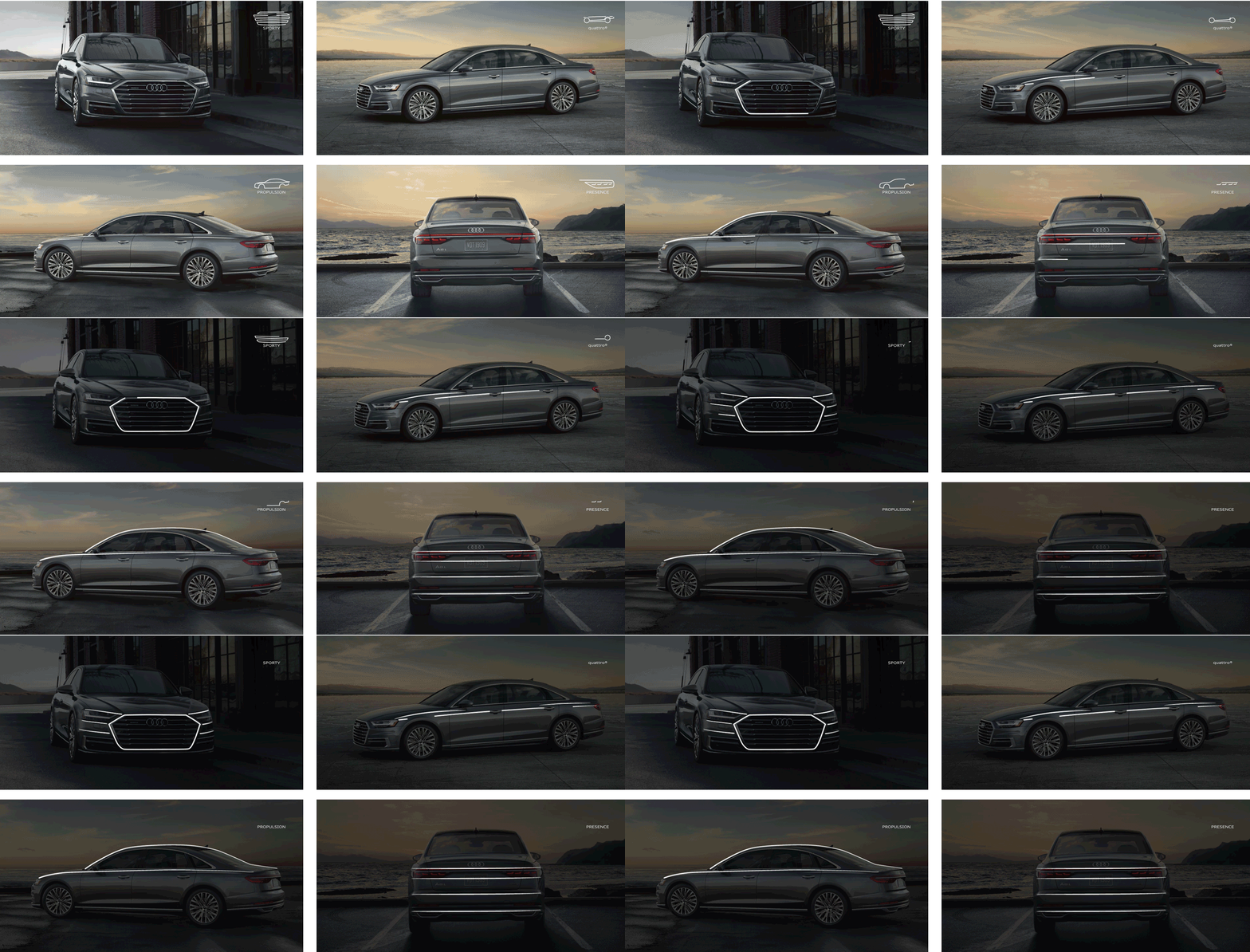
On the default state, the beauty shot is shown. The almost button-like icon on the top right queues the viewer to place their mouse over it. The word under the icon refers to what the design line is supposed to do.
As the user hovers, the image gets darker and the lines on the icon gets transferred to the car. I referenced a video of the car designer at an auto show highlight the car’s lines for the crowd.
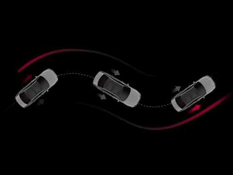
Sometimes you have to be literal, but that doesn’t mean it can’t be beautiful.

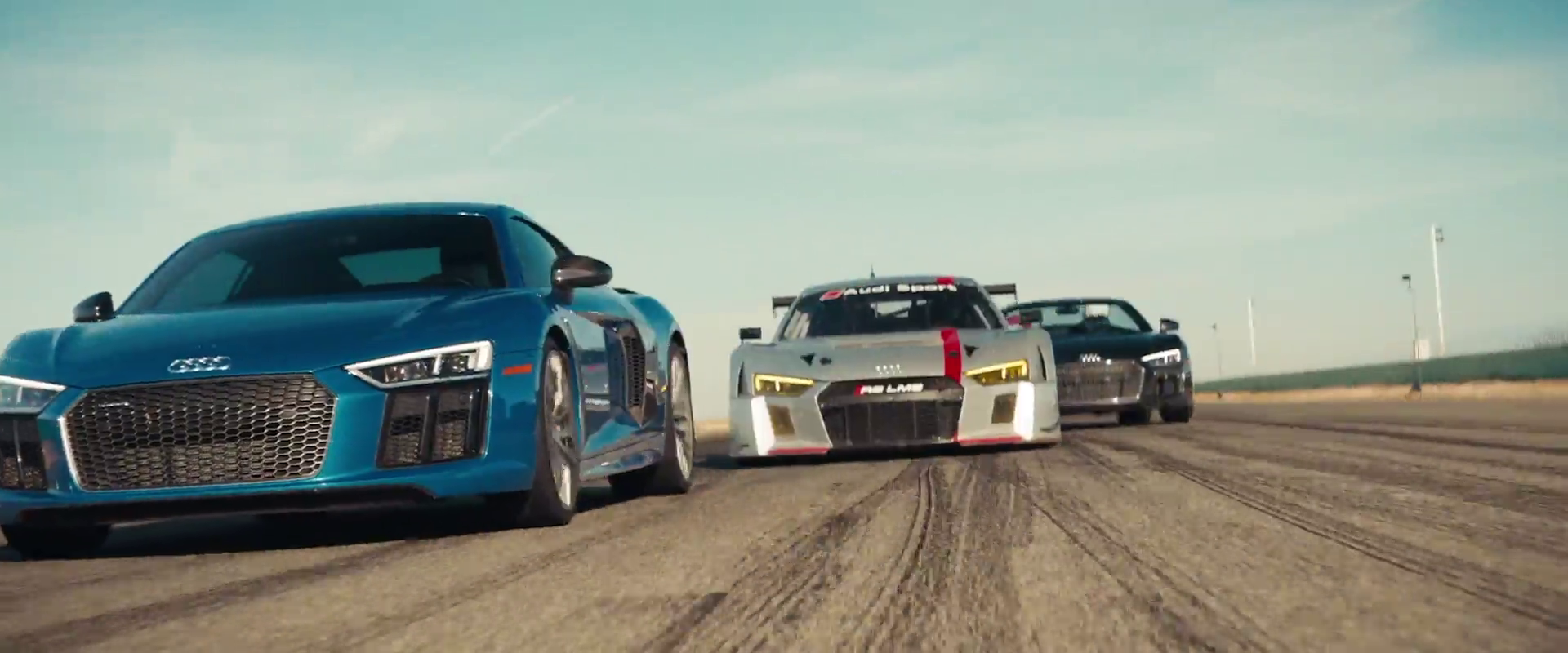
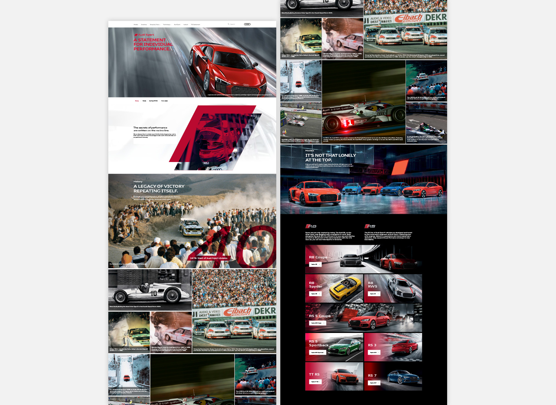
With Audi Sport, I wanted to infuse their heritage into the site. Starting with the hero, I found a way to make a concept from archival footage. My designs emphasize that the Audi vehicles today echo those from their past.
I also found ways to make old images come to life through the use of the gallery hover states.


For the next phase of our relationship with AoA, I wanted to pursue an idea that would be the evolution of the Laser Pointer. I focused on creating a story that would delve into much more than the design lines. This opened a whole slew of possibilities. The angle could change, as well as the time of day, and weather.
I also designed the component to autorotate around the car as a default. The line under every option lets the user know how much time is left before it moves on to the next option. They could interrupt the toggle simply by interacting with it.
